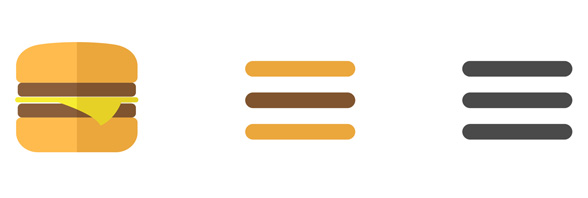
The Hamburger Menu – those three little lines at the top of most apps these days – seems to be here to stay. And as it’s a clean, cross-platform icon echoing modern minimalism, I suppose that’s OK.
But I confess that it took me by surprise. I must have been on vacation the week that it jumped from some obscure mobile site to a key element of every responsive view shrinking towards a thousand pixels. And now the burgers are popping up all over my desktop, jumping out of the windows and landing on other programs too. Like Arnold in The Last Action Hero, they’ve broken past the virtual 4th wall and colonized my screen.
Frankly, I’ve also never designed one, never whipped out Photoshop or Illustrator to conjure my unique take on the burger. That’s not to say I haven’t used them, specified them, cut ‘n pasted them. They seem to come pre-baked into every rendition of WordPress or Squarespace or whatever framework I’m using to hang your dapper HTML hats.
They’re a part of my design vocabulary, even though some studies show that using them leaves you misunderstood.
I’ll take the burger over the old days of javascript-empowered roll-over gifs. I’ll never have those hours back, days spent re-working rollovers to squeeze on more thing into an already designed and approved and top-heavy menu.

Ubiquitous as the Hamburger Menu is today, my bet is that they’re transitional. Some new trend, some new trick of the CSS will displace it before too long. Maybe something more like the Windows Start button (which won’t fade away) or some arrows denoting “expansion.” Maybe we’ll have some kids flipping it sideways and calling it the “Fries Menu,” good for left-right browsing, like Tindr for your navigation.
But maybe, like a pair of mall-bought Chucks or the Big Mac itself, the Hamburger Menu is here to stay. Not the best, not the worst, but something that works. The name could be apt. But can we think gourmet here? Move beyond the basics? Kick it up a notch? Go ahead, super-size me!


