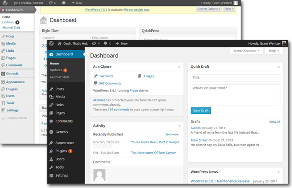
Last December, while we were all out enjoying (or possibly fretting) over the holidays, WordPress slid down the chimney and dropped off an unexpected present: Version 3.8.
One thing to love and embrace about WordPress is their frequent and unobtrusive updates. They keep you safe, secure, and ready for whatever new web-trends are about to descend. With just a click you’re all set. As their updates are so frequent and seamless, I never much bother to mention it to my clients and never specifically bill for it – like checking email, it’s just part of the routine.
But you’ll notice something different about this one right away: the admin changed color! (In fact, you can change the colors of the admin a few different ways, but that’s another post.) The other, more important aspect of the admin redesign is that it is now “responsive.” This means that the layout scales to fit your screen – from a mega-big desktop monitor down to your tablet or phone. Mobile friendly is a must these days, and WordPress is all over it.
Around WordPress HQ this new version is known as “Parker,” named after Charlie Parker: be-bop provocateur, mentor to Miles Davis, the man known as “Bird.” An innovator in let-loose improvisation, Parker’s quick crescendos and leaping lines inspired the writing of Jack Kerouac who wanted to capture that same zeal in prose, and who famously wrote that Parker “looked like Buddha.”
I like to think that this new release is designed to help you do the same – to create quick, tight, ready-for-the-stage content, wherever and whenever you’re stuck by brilliance.
Good stuff. I wanted to blog about it in the event that you’re wondering why your admin is looking a little strange. And if it’s not, let me know – Version 3.9 is due to land in April and it’s always best to keep up with these things.


