 Maybe you didn’t know there was such a thing?
If you’re not familiar with Pantone, it’s a big company in New Jersey that sets the international standards for color. While that might sound a little bossy – like a job best left up to God – it’s really quite helpful. It allows scattered freelance folks like myself to zero in on exactly the right hue so that everything can match up snazzily. From the top-boss to the printer, everyone can be on the same page, and every page can look the same.
For instance, The Gap doesn’t want the logo on some new in-store posters to be “dark blue”, they want it to be Pantone 655. And if it’s not, somebody’s going to be out of a job.
But any company that wants to stick around knows that even a monopoly on the present doesn’t guarantee future returns, which brings us back to The Color Of The Year.
Delving deep into the world of fashion and design to trendspot the next big thing, Pantone does what it can to predict the future. And as predictions can turn prescriptive and appear prophetic, their seasonal Color Reports are regarded as holy writ. These reports form a sacred safety net for designers in every consumer-driven field. By following Pantone’s recommendations, there’s a good chance that your stuff will look of-the-moment, even if the production cycle takes a few months. It’s a big business, and it all rides on a hunch and a whim.
Thus, The Color Of The Year is the only major title awarded preemptively. Can you imagine the Oscars naming the Movie of the Year before it even screens? The Grammys awarding Best New Artist to someone still in the studio? Time Magazine christening the Person of the Year based on what they think might happen over the next 12 months?
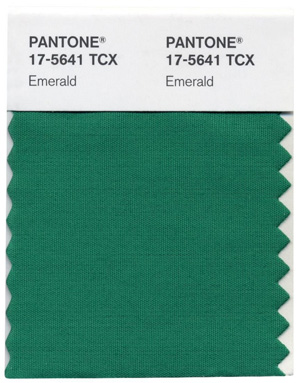
Anyway, congratulations to Emerald. She’s a classic, a jewel of a color, back from Oz and still going strong. I’m hoping for Ruby next year. It would look great on a pair of slippers.