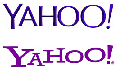
Maybe you missed it, but Yahoo! has unleashed a new logo on the internets. “Yahoo!?”, You say? Yes, and the company is still worth billions, though I’m not sure why. I still have a Yahoo email account from a dozen years back that I check maybe once a week, but if I suddenly found the service to be shuttered I wouldn’t weep. I’d take it as a sign that I should have simplified my life years ago, shed it with the old identities and obligations that I’m happy to have outgrown.

The whole idea of the “Web Portal” is so old that I can barely remember why we seemed to think it was necessary. It’s hard to fathom that you had to start surfing from somewhere, but AOL dial-up got us in the habit with our first freebie floppies. America On Line provided comfort and safety and a “you’ve got mail” home on the internet. Once we realized that there was more than one ISP in town, sites like Yahoo! provided a bit of the same security. A trustworthy aggregate of news and stocks and sports and gossip.
Which wasn’t all bad. Web Portals offered a promise of quality – some sort of check on the hodge-podge of nonsense that one had to wade through before finding what you needed. Then Google jumped in and made search so good that bookmarking has become another broken habit. Gatekeepers have their place, but we’ve grown up and the training wheels came off long ago.
I have no idea what Yahoo! offers these days. Inertia – people like me with an email account they’ve yet to fully abandon – keeps eyeballs on pages, but they’re in desperate need of some strategic thinking. Something bold, something brave. Which brings us back to the new logo and the story of how it all came together. From CEO Marrisa Mayer’s blog:
So, one weekend this summer, I rolled up my sleeves and dove into the trenches with our logo design team: Bob Stohrer, Marc DeBartolomeis, Russ Khaydarov, and our intern Max Ma. We spent the majority of Saturday and Sunday designing the logo from start to finish, and we had a ton of fun weighing every minute detail.
One weekend, eh? Now that’s hubris.
Over the years, I’ve worked with logos in dozens of different ways. I like ’em. As a kid I used to love hunting lost golf balls because every so often you got one with new corporate logo on it. They’re neat little encapsulations of identity: real or imagined, hard-earned or hoped-for. Branding is fun and fascinating, so I get Ms. Mayer’s urge to jump in and knock it out. But dang, it’s tricky stuff and one weekend ain’t enough. Just maybe it’s even the kind of thing you need to schedule during the work week, not relegate to a little beer-and-pizza overtime.
I don’t mean to pile on. The experts have already dispatched their take-downs and I’m not worried or credentialed enough to nitpick. Frankly, I’m glad that Ms. Mayer was involved in the process, I’m glad she enjoyed it. But corporate identity is a job, a discipline, a real thing to be taken seriously by professionals. Especially when billions are on the line. Right?


