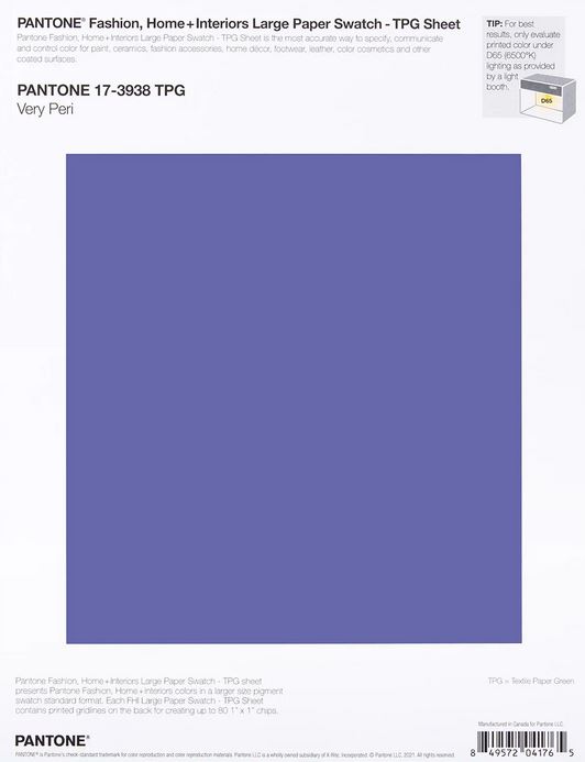
Most years I get around to (or at least think about) doing a Pantone Color-Of-The-Year post. If you don’t know about Pantone, they’re the industry standard-setter for colors, paints, and pigmentation. Is that really important? Heck yeah!
If you’ve got billion-dollar international under your stewardship, you’re going to want to make sure that the same blue is used for your signage, letterheads, and logos around the globe. If you’re cranking out gadgets from multiple factories, you’re going to want to be sure that the same tint of gold glistens from every package.
And if you’re just a starry-eyed little guy getting into the game, you’ll want to look professional too. One of the best ways to do that is to make sure that your printers, makers, and graphic designers are all referencing the same swatch when they emblazon your beautiful baby on widgets and rad schwag.
So that’s where Pantone comes in. They publish the internationally agreed upon cheat-sheet and keep an eye on trends past-and-present. Being risk-adverse, many a manufacturer will default to their recommendations, which is why every mall-store seems to be stocking the same palette during any given season.
So what’s up for 2022? Very Peri! Or you know, purple. To be honest, I haven’t seen a lot of periwinkle around recently. It’s not inescapable like the Millennial Pink wave that we all had to endure. But now that the Pantone has spoken, I’m sure we’ll be seeing a lot more purple, lilac, and the like on shelves this spring.
And it’s pretty, so I think we’ll all be ok. Still, I was hoping it had something to do with this guy:


