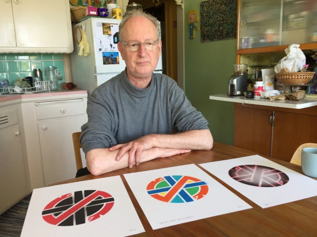
Punk Rock has always been as much an art project as a music form. From early roots in anarcho-socialist screeds to mass-market t-shirt slingers (Hot Topic!), Punk’s hard to pin down, but like smut, you know it when you see it.
I caught a video today about the inspiration behind the logo for the band Crass. The guy who drafted it, Dave King, was a graphic designer who really knew what he was doing. As a logo, it ticks all the various boxes: clear, crisp, scalable, symmetrically-balanced, recognizable in black-and-white, flexible enough to work on a t-shirt or a tattoo or most anywhere. And when you dig in, it tells a story too.
Dave was inspired by two sources: Japanese Family Crests and Celtic Crosses. However, to make it as thoroughly Punk as possible — and to tie it in with Crass’ burn-it-all-down-let’s-have-ourselves-a-proper-revolution philosophy — he negated everything such traditional symbols invoke with a criss-crossing two-headed snake. Pretty rad.
Yeah, it’s easy to dismiss Punk as grubby kid’s stuff, an enduring adolescent itch, a phase your sweet little Bobbi Sue will eventually get through. But there are hopes and dreams in those black-jacketed hearts, often wicked-smart ones at that. Ignore them not.
Viddy it up on YouTube:


