Everything’s political nowadays.
You could make the case that it’s always been that way: that we vote continually with our dollars, the words we choose, the clothes we wear, places we go. These little things we do every day betray our bent, our world-views, our hopes, dreams, and frustrations with the process.
During normal times, this is something worth a ponder. But in an election season, especially one like this, there’s no way around it. Thoughts once relegated to late-night beers and long walks are now front-and-center, dominating the air waves and defecating all over your daily news feeds.
I’ve been working on a logo revamp for a company with an alliterated “S” sound in their name. The obvious (and perhaps necessary) thing is to mold a “double-S” into some sort of icon or word-mark that’s strong, recognizable, yet still unique.
And that’s where politics comes in: Indeed, the “double-S” has been used before. Various Dodge “SuperSport” editions come to mind. But so do the Nazis.
Quick history lesson for all you youngins out there: The Nazi’s elite force was called the “Schutzstaffel,” literally “Protection Squadron” in English, although known colloquially as the Stormtroopers due to their evolution from proto-Nazi thugs and fascist-adjacent groups that embraced variations on the name.
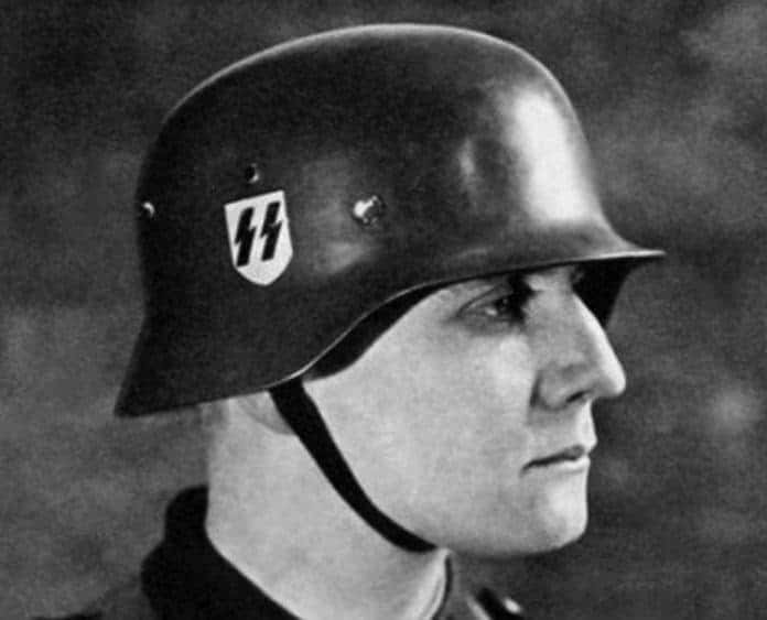
They were the worst (#understatement.) But their logo, featuring a set of lightning bolts reminiscent of Aryan runes, was bad-ass. It had everything a good logo ought: It was clear, crisp, worked in both black ‘n white and color, and could scale easily between everything from a lapel-pin to a mega-rally banner.
It was also (accidentally) kinda rock ‘n roll. Angular, pointy lettering shows up over and over again in the world of hard rock and heavy metal. As I kid I doodled a thousand variations of the treatment on my text book covers: skateboarders, band names, crush names, my name. I thought it looked middle-school cool to write out “Algebra Two” like it was a head-bangin’ missive from the Dark Side.
But it got me thinking: Have bands ever had some blow-back on their choice of font?
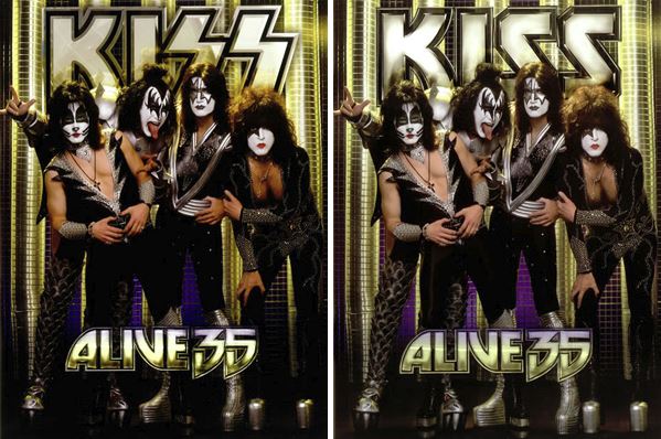
Digging around, I found this: Turns out that KISS had to change up their logo for the German market. As a band that’s always been willing to put make-a-buck commerce before artistic integrity I’m not all that surprised, but I still wish they didn’t have to do so. A band founded by a couple of Jewish kids wasn’t exactly trying to channel Kristallnacht from Brooklyn.
Anyway: Context matters. As a designer you need to know exactly how your work will be interpreted in the marketplace, regardless of your initial intention. So it’s back to the drawing board on my logo project. The tight, sharp lines I’ve been sketching have to go.
Leave it to the Nazis to ruin everything.