Someplace it’s spring, and the urge to get outdoors is hitting this desk-bound design-guy pretty darn hard. When I do get out, I like to get way out, where you can’t hear cars, can’t spot power lines, and just far enough out of signal range to provide a reasonable alibi.
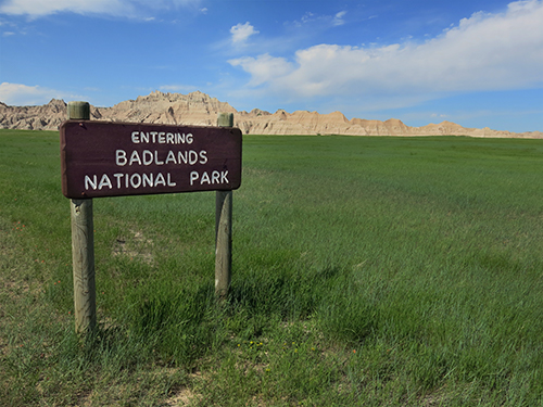
Our National Parks are some of the last off-the-grid refuges for this wanderer, and now that I live sorta out west, I’ve been seeing more and more of the big ones, the legendary ones, and loving it when I get the chance.
‘Til the next time, here’s something to bring a blast of that optimistic, can-do, Teddy Roosevelt spirit indoors during these final dreary, rainy days of April: For your next project, download and use the iconic typeface found on National Park signs for free.
From what I can gather, there’s no direct link between this project and the parks themselves. It’s just the work of some energetic designers from the University of Kansas who thought they’d bring a little inspiration back from the woods. Which I guess is a-ok. What’s the cliche? “Leave only footprints; Take only memories”?
Inspiration is pretty close.
They’re part of a university course called “The Design Outside (DO) Studio.” Take a look at some of the ways the team has used the font, and download it here for your next design adventure.
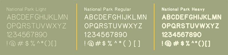
Of course, the real signs are wood, and routed. So the “officially” official font might not even be a thing. However, there’s no doubt that the parks have some standards on stencil sizes and shapes and whatnot, maybe even a few CNC machines in the works these days. Seems there’s too much continuity around the country for this to be some sort of spontaneous typographical occurrence.
Anyway, that’s something for me to chat about with a lonely park ranger… some day soon… a little further on down the trail.