As many of you’ve heard me mention, I’ve been reading The Economist thoroughly, if not exactly cover-to-cover, for years. Giving the crisis-du-jour time to bounce off of a desk somewhere in London before it circles back to my ears really takes the edge off. It also allows some perspective. The limitations of physical print-space separate out the novel from the newsworthy, the scandalous from the serious. And if there’s some true emergency, there are plenty of other outlets screaming for my attention. Print reading can only keep your mind off the grid for so long.
But let’s talk about their covers for a moment. First of all, you’ll have to do some digging to know who’s designed what: The Economist has a tradition of anonymity. By-lines and credits are not to be found. Recurring columnists write under pseudonyms. It’s part of the charm. You also won’t find splashy profiles or meticulously planned photo shoots. No Annie Leibovitz-y celebrations of the human spirit here. Focusing on the news, not the newsmaker, more often than not the cover will be a deceptively simple illustration, light on words, high on pointed visual puns. This continues throughout the magazine, where you’re as likely to see a poignant illustration or cleverly executed chart as a photograph or two.
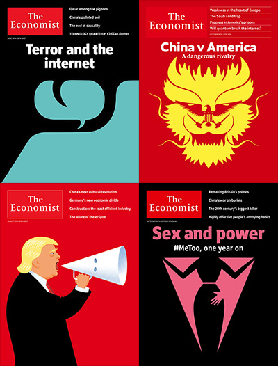
Above are a few examples that have stuck with me: Online words triggering real-life violence; politics amplified through the bullhorn of racism; a suit-and-tie turned groper’s guise; an armed eagle in the face of a menacing dragon.
Plenty more out there. Some that cut left, some right, some straight down the middle. Unless the topic is Brexit. They will always and forever be against Brexit, no question on how they’ll cover that.


