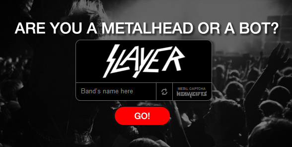
Band logos. Where did they go?
I’m thinking this is a lost art. How many bands really do logos these days? I’m not talking typography – fonts and treatments that get attached to certain albums and associated marketing campaigns – although that’s a thing and I shant discount it. But right now I’m talking about a proper logo: a real stand-out stand-alone graphic. Think Public Enemy’s Man-In-The-Crosshairs. The three boxed-up letters that shout “NIN.” Or AC/DC’s squealing thunderbolt, shot straight through the listening eye of the beholder.
Does Coldplay have a logo? Mumford & Sons? Nickelback? Of what need hath the Imagine Dragons of iconography? I dunno.
Not too long ago, there was a trend where everyone had to have a logo: Designers, celebrities, sports figures, hot shots. It wasn’t enough to have a name (like Jim Croce and his daddy did.) Personal branding was the thing. It was the “we’re all entrepreneurs” theory of career development, where no one wanted to admit they were beholden to another, playing for a team. Where no ego could submit to the commonweal.
That was a little much, though it kept a few of us side-gigging graphic designers more gainfully employed. For that we are grateful.
But band logos are sweet. I grew up with them, collected them in the form of buttons and pins, bumper stickers. Snipped them from CD long-boxes for the wallpapering of locker doors. Found them embroidered on patches in the basket by the checkout at the record shop. Brought them home and watched them pile up in bottom desk drawers, waiting for the right piece of denim with which to fuse forever with hot iron.
Punk bands did it pretty well. Alt-Rock had its moments of glory. But no one did logos better than the Metal guys. Even the pop side could rock a black-and-white swath of pointy glyphs with pride. Def Leppard! Van Halen! It was part of the gig, part of the fun of dreaming up a band. Of course, it had to be something not too complex, something simple enough, memorable enough to be doodled on the backs of notebooks and pen-knifed into study-hall desks.
I wonder if that was a design concern. Were there consultants for such things? Did they sit back and ask their hairsprayed clientele: Does it scale? Will it work as a tattoo? Embroidered on a bandanna?
Metal being the boys club that it is, one-upsmanship is to be expected, embraced. Can we play it faster? Louder? Take it higher? Why, yes We CAN!! Logo design has been, no doubt, subject to the same arms race of awesome. And so we go from the dangerously sharp through a creepy-crawly evolution to the absurd.
Sometimes they can even be a little hard to read, an undecipherable challenge for both man and machine. Which brings me back to the impetus for this post.
We’ve all had to fill out an “I’m not a robot” box on a website, trying to make sense of a garble of numbers and text. By using heavy metal logos for the Turing test, the new service Metal Captcha let’s you have a little fun with the process. In one step, you can prove that not only are you not a robot, you’re a Metal Head too.
The next time I’ve got a client with a spam problem, I’ll give it a try. Suit-and-tied in a client meeting, I’ll raise a horned hand and gently suggest that maybe, just maybe, it’s time to get a little more metal up in here.


