
I’ve really enjoyed doing a bit of photography for my clients. I don’t claim to call myself a professional picture-snapper (I know enough to know what I don’t know!) but when you’re a jack-of-all-design-trades craftsman like me, you tend to get called in on new projects all the time. And that keeps it fun.
When I came across this article on Apple’s go-to guy, Peter Belanger, I knew I had to share it. Just the title alone summed it up: “The Illusion of Simplicity.” That’s a thing to ponder. The “illusion of simplicity” applies to the results of every creative pursuit. When you can see the process in the product, something isn’t quite right. It should seem simple, it should seem easy. That’s what professionals do, right? They make it look easy. Whether we’re talking music or writing or coding or product photography, when everything is right, there’s a lot you don’t notice. The illusion is complete, and it looks meant to be.
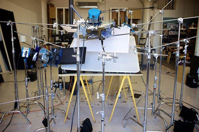
You don’t think about things like the temperature of light until you try to do some precise photography. You don’t think about how your room changes as the sun arcs past your windows through the day. You don’t notice that some shadows are yellow and some are blue until you move a few different types of bulbs around the room. And once you do start to see the differences, you find that all the solutions come with compromises and surprises, bringing out different aspects of the subject you’re trying to capture.
Take a look at the video below that shows just what can go into getting one shot for the cover of a magazine. Multiply by every image in the issue, or every product in the catalog. Yowzers. But when it’s all done, you don’t think about it. It just looks right. The way it should be. As if the still-smiling photographer hardly had to do a thing.
That’s the trick, innit?