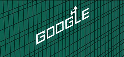
 If you didn’t catch yesterday’s Google Doodle paying tribute to designer Saul Bass, it’s not too late. The magic of YouTube preserves all things for posterity.
Even if you haven’t heard of Saul Bass, I guarantee you know his work. He was an exceptionally influential graphic designer, designing logos for such little companies as AT&T and United Airlines. You’ve seen his stuff. Everywhere.
But I love him for his movie work – he did the title sequences and associated posters for a slew of Hitchcock flicks and other classics like West Side Story. Not sure that he was one to take sides, but I bet the man was a Jet.
You’ll have to watch the video to get the full effect of Google’s tribute. The stills posted here don’t tell the whole story of his animations. It’s interesting to consider how adept he was at the still-evolving craft of moving pictures. Most graphic designers that I know consider animation a separate art (and were more than happy to outsource Flash when it was still a viable platform.)
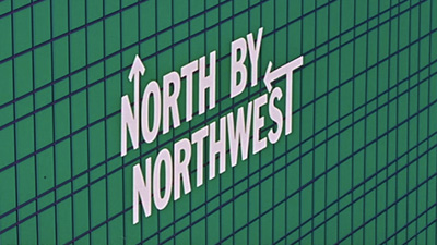 I remember watching his work for the first time on off-hours UHF broadcasts. As a kid, I never watched TV without a paper and pencil on my lap, sketching something or another. After a Saul Bass title sequence I was too distracted running over the magical geometry in my mind to pay attention to the rest of the film. (Something about Cary Grant besot with mysterious troubles beyond his ken, right?)
Saul Bass was part of a generation that birthed a new cool, with work that re-defined “modern” as “timeless”. His influence lives on, from obvious tributes like Mad Men’s intro to an indie-rock poster pasted to a venue near you. That being said, I do have one concern. If I were lucky enough to have a surname spelled “B-A-S-S”, I’d insist it was spoke with a long “A”. Not like a fish, and make that doubly true if I was fronting a boy band.
